Maximize engagement with a responsive solution.
A 100% customized, mobile responsive site allows visitors a one-stop place to find all up-to-date information regarding services and updates. Google rewards sites that are mobile-friendly and penalizes those that are not. Responsive web design is a must in terms of SEO (Search Engine Optimization) strategy plans and a feature we make a priority on all our websites.
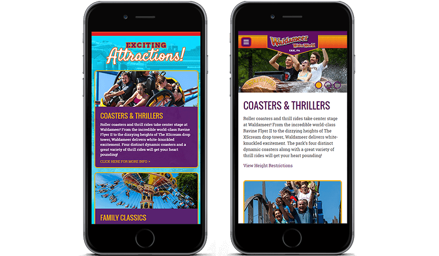
Fluid content layouts scale up or down.
From desktop, to phone, to tablet, our responsive sites are fluid and scale up or down as needed to best fit the screens being used to access the site. All sites boast interactive elements such as sliders, forms, calendars, maps, videos, photo galleries and more that scale responsively and ensure consistency of information across all devices.
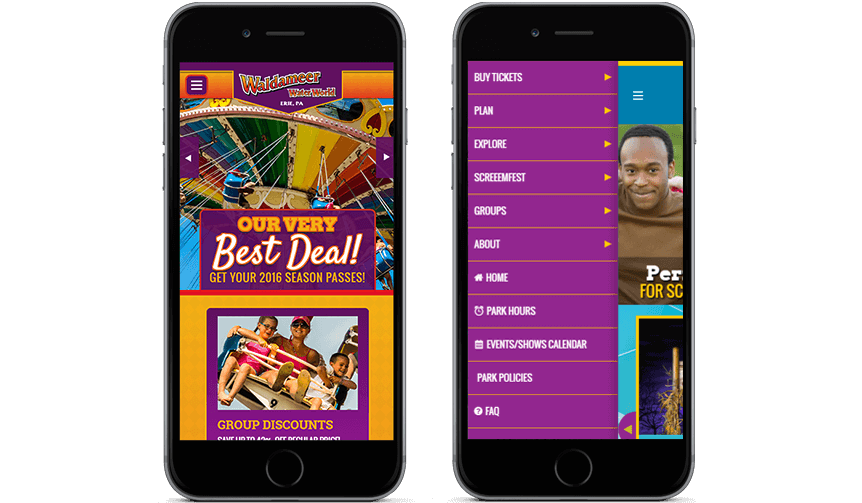
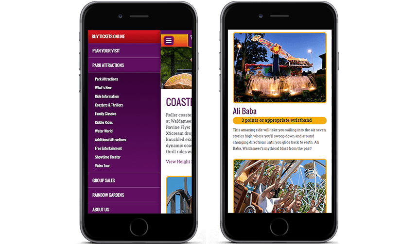
Slide-out menu for targeting mobile users.
A menu structure that works well on all devices is crucial. A responsive slide-out menu keeps navigation neat and the site intact. Regardless of which device a visitor may be using at a given time, the menu will scale responsively.